-
Adds
-
Categories
Lessons learned
Lessons learned with cascading stylesheets
Here I have been collecting my lessons learned over the passed few years over Cascading stylesheet problems. Hope I can help you with some problems you have.
IE only workarounds
To create styles that only work for IE you can add the stylesheet in your page inside a conditional comment block in your page :
<!–[if IE]>
<link media=”screen” type=”text/css” rel=”stylesheet” xhref=”/ie-style.css” mce_href=”/ie-style.css” </link>
<![endif]–>
you can use lt, gte and gt to define another version but most of the time you don’t have to use these additions
Or you can use the style addition * html in your stylesheet classes. IE can style the element wherease the other browers can start with changing styles only containing inside a body tag.
NON IE workarounds
If you need a workaround only for non IE browsers and you can’t use the * html workaround than you can use the > selector. This will only target non IE browsers (<= version 6)
Extra wrapper
Sometimes it’s better to work with a padding on an extra wrapper than with margins of an element. For example if the styled element doesn’t always have the same margins in all situations or when Some browsers (IE) don’t conform to the standards. Using pseudo styles can’t be used for IE yet.
Expression for IE in stead of max and minwidth
You can add expressions in your stylesheet for IE. IE doesn’t understand min-width and max-width yet but does understand expressions (no other browser understands these) so you can use expression to mimic min and max widths.
width: expression((document.documentElement.clientWidth < 760)?720+"px":(document.documentElement.clientWidth > 955)?915+”px”:”100%”);
Redefine standard element settings
Some browsers add extra padding or margins on html elements like
LI, UL, Form IMG tags, but the widths are not all the same. So you can redefine the element with a style do be sure the elements show the same in all browsers. Most used are
- changing display for blocked level items to inline; like form tags or img tags to get clear of the extra space under an image.
- resetting padding and margins; like headers and paragraphs
- resetting list type and position

Fix floating clearing
When a container holds a floating element, the height of the container will not grow with the height of the floating element unless. When the container has a background image or color this will show very strange. The let the container grow with the heighest element use the “haslayout” technique for IE and the clearfix technique for most other browsers.
The ‘haslayout’ technique for IE is nothing more than defining at least a height or a width for the container. Mostly used is height:1%;
Also when IE has a background and you don’t see it try to use the ‘haslayout; technique
The haslayout technique is not necessary for IE5 for the Mac and will be hidden for this IE browser.
/* Hides from IE5-mac \*/
* html .buggybox {height: 1%;}
/* End hide from IE5-mac */
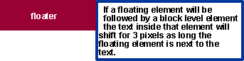
IE 3px text jog
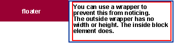
If a floating element will be followed by a block level element the text inside this element will shift for 3 pixels as long the floating element is next to the text. To prevent the text to show indented you can add an extra wrapper. The extra wrapper haslayout and the container hasNOlayout (no height or width). Than the text will be shifted 3px together.
Example in IE(win)
Solution: extra wrapper.
ClearFix
This is no hack but is used to clear floating without adding an extra div tag and the style clear:both.
See Clearing Floats without Structural Markup
How many time do you see a
content:”.”;
display:block;
height:0;
clear:left;
visibility:hidden;
}
Horisontal center layers
You can only center inline elements inside a block element when the block element is defined as haslayout .
You can center smaller blocked elements inside a block element using margins-left:auto and margin-right auto on inside elements and use text-align:center for IE on the parent element.
.centerelement {
margin-left:auto;
margin-right:auto;
}
.wrapper{text-align:center}
Other Bugs fixing
IE/Win Guillotine Bug solution : element hasLayout.
IE/Win Unscrollable Content Bug solution : element hasLayout.